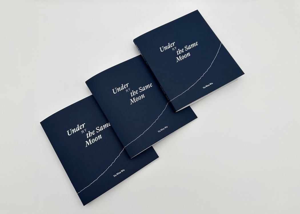
Under the Same Moon, front covers (above). Image courtesy of Mary Yang.
As we approach the final days of Yu-Wen Wu's solo exhibition, Re/Generation, at the gallery, we want to highlight one of her collaborators, Mary Yang. Mary is a designer and educator based in Boston; she led the design of Yu-Wen Wu's first monograph, Under the Same Moon, available for purchase at Praise Shadows Art Shop.
The following conversation is between Mary Yang and Jayna Mikolaitis, Gallery Manager of Sales and Marketing at Praise Shadows. This conversation centers Yu-Wen and Mary's respective practices and sheds light to their collaborative process in the making of Under the Same Moon.
Jayna Mikolaitis: Hi Mary. I'm excited to talk about Yu-Wen's work and your design process for her monograph, Under the Same Moon. I'm fortunate to know a bit about your design practice after taking design courses from you at Boston University, Graphic Design. Thank you for joining me today; I'm so happy to reconnect. Could you share an introduction to your work for folks who aren't familiar with it?
Mary Yang: Thanks, Jayna. It's a pleasure to reconnect here. I run a design studio practice, Open Rehearsal. We primarily work with cultural and academic institutions on book design, exhibition design, identity design, and editorial projects.
JM: How did you connect with Yu-Wen for this project?
MY: Yutong Shi, curator, writer, and the editor of Under the Same Moon, reached out to me to invite my studio to design Yu-Wen's first artist monograph. Yutong and I had always wanted to collaborate with each other on a project ever since we met at Boston University while she was a graduate student and where I teach. I was drawn to and resonated with many of the themes in Yu-Wen's work, including transformation, movement, migration, and identity. I was delighted to take on this project and to engage in conversation about how to translate and reimagine Yu-Wen's work through the form of a book.

Spread featuring conversation between Yutong Shi and Yu-Wen Wu.
JM: I can see common threads between your work and Yu-Wen's. This book also encapsulates so many of Yu-Wen's recent achievements including her exhibition at the ICA Boston and acquisition by the Harvard Art Museums, which we'll talk more about later. In early conversations about the monograph, did you arrive at any design choices right away?
MY: When Yutong first approached me about the project, she emphasized the importance of material and materiality in Yu-Wen's work. Gilding, red thread, tea leaves, porcelain, and lotus leaves are significant materials in her practice. They are associated with Yu-Wen's ancestry and more broadly, with Asian history and culture. It was important to me to explore ways to integrate, or visually represent, these materials through the selection of images, color, paper choices, printing, and binding technique.
Testing color and materials.
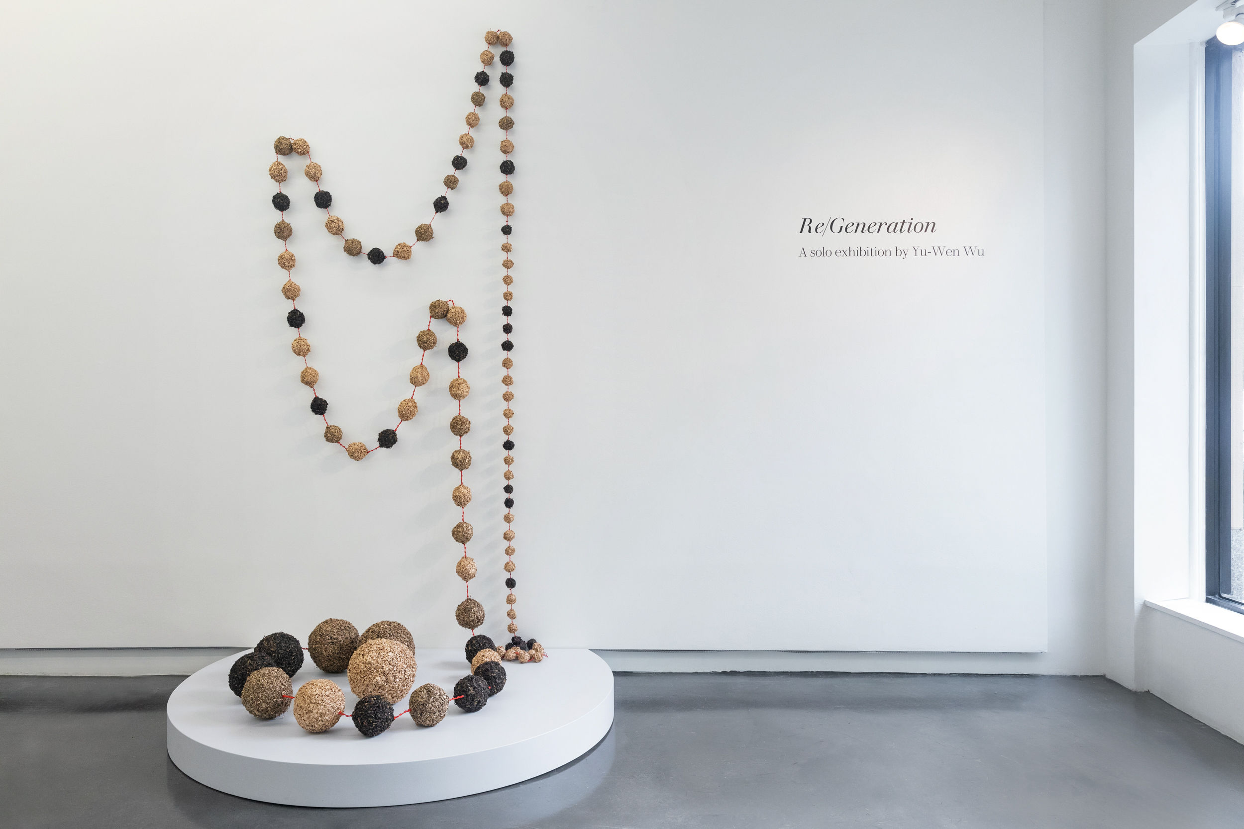
JM: Those materials-gold, red thread, and tea-conjure so many images of her work. My mind jumps to her latest piece Recitations in Re/Generation. It's constructed of Taiwanese tea leaves that have been dried, sculpted into orbs, and strung in the form of Buddhist mala beads. Each orb of tea leaves is either gilded, painted with a muted shade of gold, or made up of preserved, but otherwise untouched, tea leaves.
As I'm flipping through her book, I see nods to these materials. What are some examples of material choices within Yu-Wen's monograph that relate to her practice?
 Installation image of Recitations in Re/Generation. Image by Dan Watkins Photography.
MY: There are many intentional design decisions that we can talk about, but I'll touch upon a couple of material and design choices.
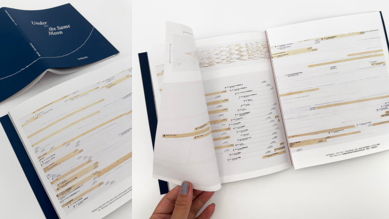
As you open the book and before you see the half title page, we are immersed in a reprinted detail of Yu-Wen's piece from her Orientations series. The translucency of the vellum acts as a window or lens for entering into Yu-Wen's work. This material choice is in reference to her use of Dura-lar in her moon drawings and in Walking to Taipei.
In the conversation between Yutong and Yu-Wen that's featured in the book, Yu-Wen talks about while growing up in Taiwan, her grandfather taught her how to cut rice papers and bind the sheets together with thread to make a simple book. It felt right to honor this process of book binding by binding Yu-Wen's monograph similarly as a single signature with a saddle stitch right through the center of the book. And of course we used red thread. Yu-Wen speaks about the significance of red thread: "The red thread is another connective intention, bearing cultural resonances associated with the ties that bind souls between phases of existence, across geographies and lifetimes." Since the book is bound as a single signature, [meaning the book is a single stack of nested and folded papers] it opens up naturally and lays flat at the centerfold, where the red thread is exposed at the heart of the book.
Orientations I printed on vellum, preceding the half title page
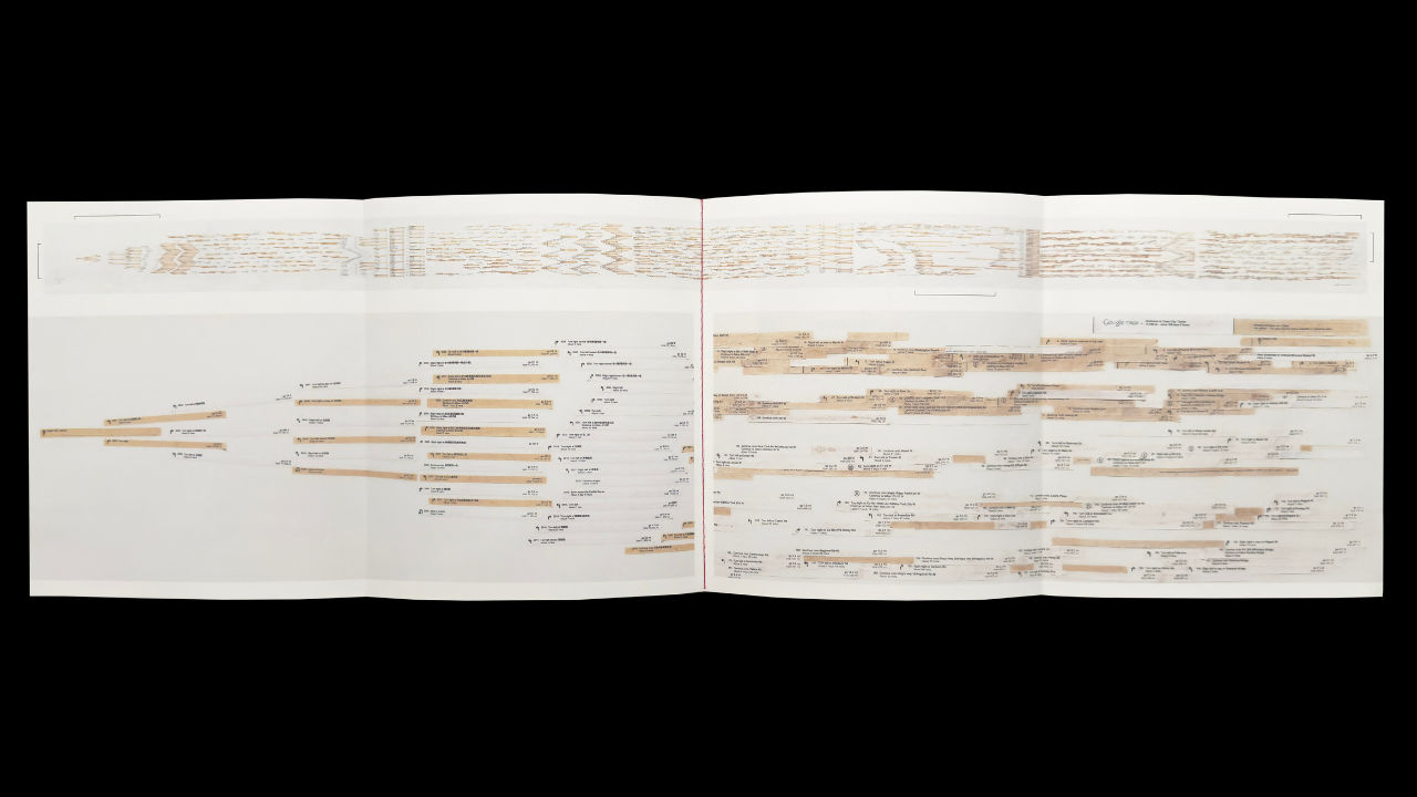
JM: You mentioned the book's centerfold and this one is pretty special. The central spread of Yu-Wen's monograph highlights Walking to Taipei, a 20-foot artwork that takes the form of a traditional landscape scroll. The contents of the scroll narrate a miraculous journey of how to walk from Boston to Taipei by foot, provided by a spontaneous Google Maps search from more than a decade ago. The piece is now in the permanent collection of the Harvard Art Museums and marks a pivotal point in Yu-Wen's career.
The contents of this scroll are so rich. The map directions take you through the United States, in a kayak to cross the Pacific Ocean, and on a jet ski to navigate between mainland China and Japan. How did you approach designing all of this content? And how did the artwork inform the final design of centerfold?
MY: The centerfold features Walking to Taipei, through the form of a double gate fold [also known as a fold out section]. The scale of the original piece is a 25-foot-long, 20-inch-tall handscroll. Our goal was not necessarily to reproduce the scroll in its entirety, but rather to give a sense of the experience of viewing and reading the piece. When I asked Yu-Wen and Yutong which section of the scroll should be featured in the centerfold, they both said the kayak section!
Just as with viewing a traditional handscroll, the double gate fold is viewed from right to left, in sections at a time. When you open the double gate fold, on the right side is a detail of the beginning of the scroll (starting in Boston) and on the left side is the end of the scroll (arriving at Taipei). The two cities meet and greet each other in the centerfold.

Front and back covers; centerfold .

Opened, double gate fold featuring Walking to Taipei (right pages, Boston; left pages, Taipei)
JM: That's a beautiful detail that pays homage to such a monumental piece. I also see this metaphorical meeting spot- of Boston and Taipei- mirrored in the choice to include English and Traditional Chinese in the book. Can you tell me about the process of designing bilingually? What are some of the challenges that arose and how did you navigate them?
MY: Since the book was going to be bilingual and therefore, potentially text heavy, we wanted to strike a balance between text and image. The book also debuted during Yu-Wen's first art fair at Taipei Dangdai in Taiwan, so I was also aware of the international readership and wanted to balance access to both languages through the typography and design.
Earlier on in the design process, I worked with collaborator Jialun Wang who has expertise in Chinese typography and typesetting. For the English text, we selected the typeface Kleisch designed by Taiwanese type designer Chiachi Chao. In working with the typeface, we were drawn to how the uppercase letter forms implied a sense of movement emphasized by the exaggerated diagonal stroke in the "A." This also inspired us to lean into the concept of walking and lateral movement as conveyed through a diagonal line-conceptually tying back to Walking to Taipei. Building on these concepts, the two languages are connected through an underlying diagonal grid. The diagonal grid allowed us to visually balance the paragraph lengths since the Chinese text is typically shorter than the English text. This is due to the fact that Chinese type is monospace (each character occupies the same amount of horizontal space).
Diagonal grid
JM: Compromising space without comprising function is an age-old puzzle for designers; I'm amazed at how effortless you make it seem. Thank you so much, Mary, for your generous insights about the production of Under the Same Moon. Before we completely sign off, I want to ask you one (maybe two) last questions about designing artist books.
As a professional in your field, you've designed a range of printed and digital matter for institutions, exhibitions, and experiences. What do you think makes artist books so special? And, from the perspective of the artist and designer, what do you think the role of the artist book is in contemporary design discourse?
MY: I love how Ulises Carrión, conceptual artist and writer, describes books in his manifesto The New Art of Making Books: "A book is a sequence of spaces. Each of these spaces is perceived at a different moment - a book is also a sequence of moments. A book is not a case of words, nor a bag of words, nor a bearer of words."
In addition, a book is not merely a container of words and images, but it can embody its subject matter and exist as an autonomous form. To me, the beauty of an artist book is that it is meant to be experienced and interacted with through the form, materials, sequencing. The process for designing Yu-Wen's monograph was a result of collaboration and dialogue among the artist, editor, and designer. As the designer, I appreciated Yu-Wen and Yutong's openness to the level of unconventional materials, binding technique, and typesetting that an artist book affords.
I hope that Yu-Wen's monograph helps to expand her narrative, document her practice and scholarship, and provide new ways for us to experience and engage with her work.
Select spreads from Under the Same Moon
JM: Mary, this has been such a wonderful conversation. It is a privilege to learn from you, in and beyond Boston University. Thank you again for your time. This monograph is so thoughtful and reflective of Yu-Wen's practice, I can't wait to see what comes next for her! I'll see you soon (likely in that crazy intersection on Comm Ave).
Mary Yang is a graphic designer and educator based in Boston, MA. She is the founder of Open Rehearsal, a design practice that works with clients and collaborators in the arts and academia on publications, exhibitions, and identity design. Previously, she has worked with Harvard University, deCordova Sculpture Park and Museum, Rhode Island School of Design, among others. She is also the co-founder of Radical Characters, a study group and curatorial project that researches and explores graphic design, typography, and culture through Chinese characters. Yang is an Assistant Professor at Boston University where she teaches in the undergraduate and graduate Graphic Design programs. Her research and pedagogical approach examine how language can be used as a tool for cultural exchange, co-building history, and cultivating collection sites for knowledge.
Under the Same Moon is the first monograph on artist Yu-Wen Wu's multidisciplinary work of time, transformation, movement, and migration. Featuring new scholarship, the publication examines Wu's practice through the lens of her chosen materials. As she has said, "Material and materiality have always been fundamental to me as metaphors to express emotions, memories, and storytelling." Released in anticipation of her debut at Taipei Dangdai and her second solo exhibition at Praise Shadows Art Gallery, this volume includes insightful contributions from Wu's longtime collaborators, offering readers a timely opportunity to gain a holistic understanding of the artist's subtle and profoundly moving work.
The book is available for purchase here.
Contributors
Edited with interview by Yutong Shi. Words from the Artist by Yu-Wen Wu. Introduction by Sarah Laursen. Essay by Anni A. Pullagura. Object Entries by Suna Cha, Ellie Yunjung Choi, Sarah Laursen, Gabrielle Niu, and Yutong Shi.
Design
Designed by Open Rehearsal, Mary Y. Yang, and Jialun Wang
Details
Languages: English and Traditional Chinese
Format: 88 pages, debossed foil softcover, color digital, offset double-gate fold
Dimensions: 8 × 9 inches
ISBN: 979-8-218-38854-6
Published 2024


